
Aspect Ratio Controls
Native Divi 5 lives at Design › Sizing › Aspect Ratio. It locks a module’s width-to-height proportion as it scales, so grids and media stay uniform no matter what the source dimensions are — no custom CSS, no plugins. It is always paired with two more native controls on the image: Object Fit: Cover (fills the locked box without stretching the photo) and Object Position (chooses which part of the photo survives the crop). Every image below is labelled with its native pixel size so the normalisation is visible. Five production patterns follow.
The problem — mismatched source images
Three photos placed at the same column width but with different native ratios. With no aspect ratio set they keep their own proportions, so heights disagree and the row is ragged.
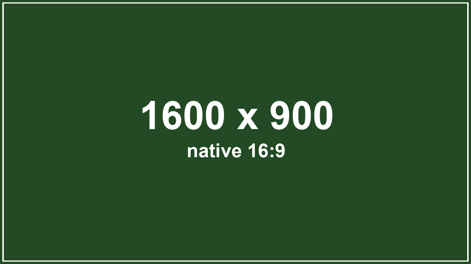
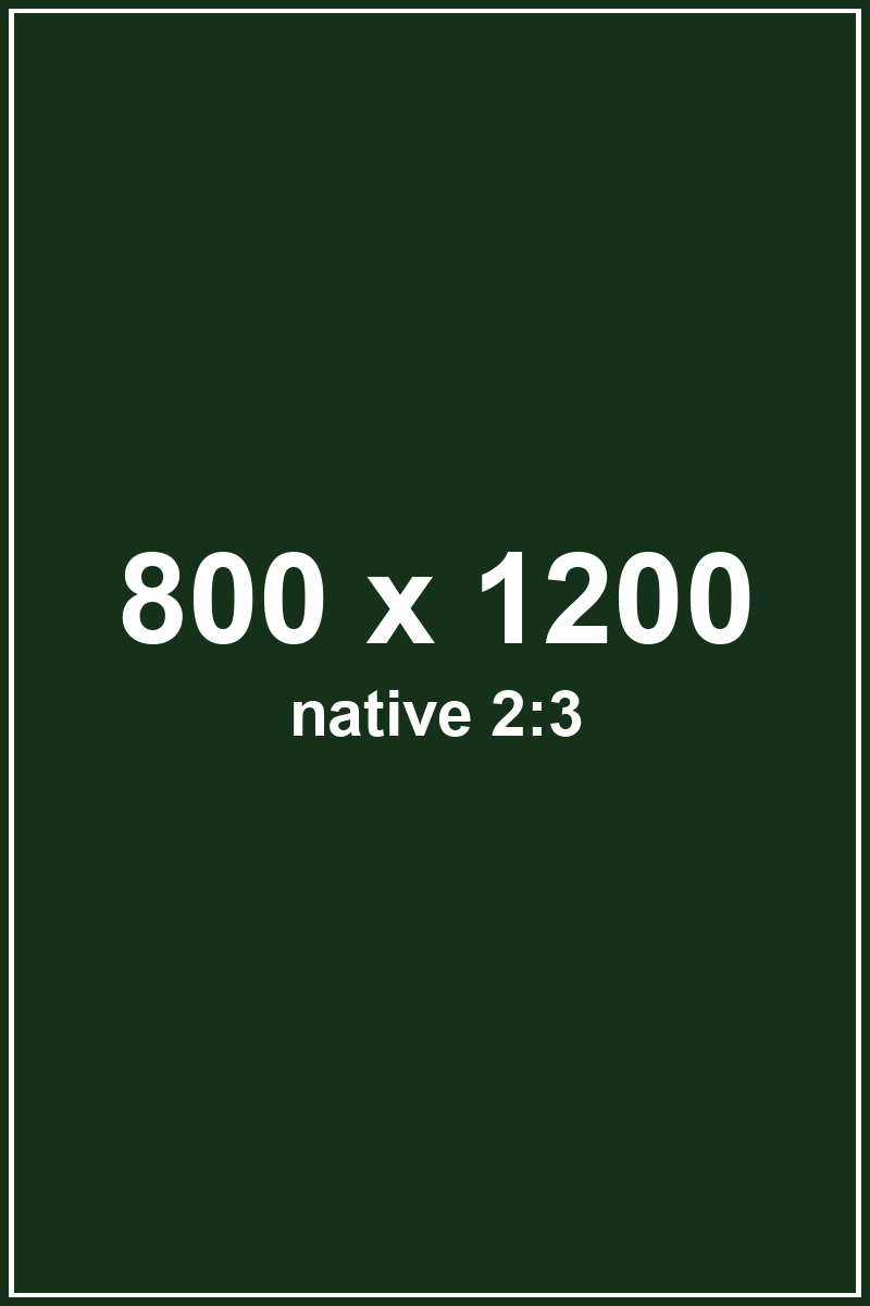
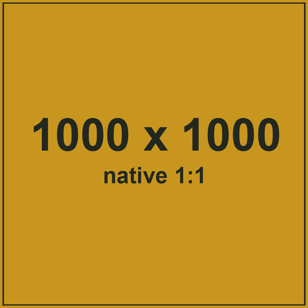
Same width, three different heights — an uneven grid.
Pattern 1 — Hero / full-width media crop (16:9)
A single banner image locked to a consistent wide 16:9 with Object Fit: Cover, Object Position: center. The hero holds the same cinematic proportion on every page even when the uploaded photo does not — here a 7:3 ultrawide source is normalised.
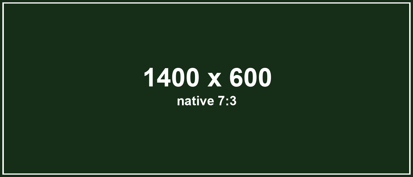
Native 7:3 → locked 16:9. Swap the photo for any ratio and the hero box never changes shape.
Pattern 2 — Service / card thumbnail consistency (3:2)
The most common use: a card grid where every thumbnail must match. Each image is locked to 3:2, Cover, center. The three sources are deliberately different ratios (16:9, 3:4, 1:1) yet the tiles are identical — and any future upload normalises the same way.
Three different native ratios, one uniform 3:2 grid.
Pattern 3 — Portrait / team crop (4:5, from the top)
Team headshots want a consistent 4:5 portrait and a crop that keeps faces in frame. Object Position: center top anchors the top of each photo, so heads are never cut off regardless of the source ratio.
Locked 4:5, anchored to the top — a tidy, uniform team strip.
Pattern 4 — Square / brand tile grid (1:1)
A four-up brand/social wall locked to 1:1, Cover, center — the Instagram-style square every source falls into cleanly.
Four sources, four identical squares.
Pattern 5 — Responsive editorial media block (4:3)
An image-beside-copy block where the media is locked to 4:3, Cover, center. The picture keeps a clean rectangle next to the text at every breakpoint; when the columns stack on mobile the ratio is unchanged, so the layout never turns ragged.
A media block that never breaks the grid
Copy sits beside a ratio-locked image. On desktop the two share the row; on tablet and phone they stack, and because the image ratio is fixed at 4:3 the block stays balanced instead of collapsing to whatever the photo happened to be.
Object Position — the same crop, framed three ways
One identical source (3:4 portrait) locked to the same wide 16:9 box with Cover. Only Object Position changes — top, center, bottom — and the surviving slice of the photo moves with it. This is how you keep the subject in frame after a hard crop.
Object Position: center top
Object Position: center center
Object Position: center bottom
Bonus — reserve space for async embeds (zero CLS)
The same control on a non-image module. A Group locked to 16:9 holds the exact box a video, map or form iframe will fill before it loads, so nothing below jumps — a direct Cumulative Layout Shift (Core Web Vitals) win, still with no custom CSS.
16 : 9
reserved embed space
Swap the iframe in later and the page does not move.
How each pattern was built (native controls only)
Image module › Design › Sizing › Aspect Ratio (set width:height, e.g. 16:9 / 3:2 / 4:5 / 1:1 / 4:3), plus Object Fit: Cover and Object Position in the same Sizing group. Force Fullwidth is on so the image fills its column and the ratio governs the height. The bonus box is a Group module with the identical Aspect Ratio control. No custom CSS, no code module, no plugin — every value is a native setting, and colour/type/spacing resolve from the BYS Design Variables.